Three louder directions
Same palette, same typeface, same restraint. What changes is that your actual work does the talking and the headline says something only you could say. Two of these move.
A short claim specific to what you do, with the portfolio scrolling beside it on a slow loop. All the colour comes from the work, none from decoration.
I make brands worth following.
Social, campaigns, and creative for brands that would rather be looked forward to than scrolled past.

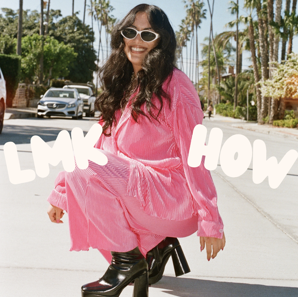



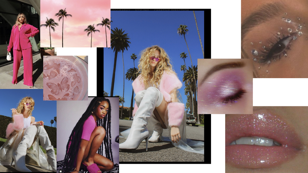


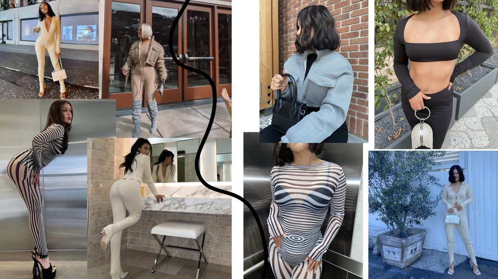
The boldest of the three. One result set enormous, with the work running underneath. This is the version someone remembers an hour later.
Your palette, inverted. Nothing moves. It trades warmth for contrast and makes the colour in your work hit harder than it can on cream.
Brands that get looked at twice.
Social, campaigns, and creative for brands that would rather be looked forward to than scrolled past.